Wednesday, 4 December 2013

Klee at Tate Modern

The Klee show is enormous - 17 rooms' worth of small works - but well worth the effort if you have an interest in Klee's development as an artist. Actually, it's also interesting as a detailed example of how an artist develops his ideas and techniques, absorbs influences, and works hard to produce something unique to him or herself. As it turns out, the point about Klee is that he developed throughout his career; there isn't the typical development to a mature style which is maintained until (usually) the work becomes weaker: on the evidence of this show, Klee explored and mastered new ideas and styles throughout his life, even when he was dying of a degenerative disease.

The big surprise for me was the range of influences shown in Klee's work - he came into direct contact with many of the most significant art movements in Europe during his lifetime, from German expressionism to Russian constructivism and Dutch surrealism, and it seems all these influences were considered, studied, and expertly absorbed into his own work. This makes it impossible to place him within any one movement, but he seems to have maintained good relations with all of them. The works themselves range from the abstract to the semi-abstract to the figurative, and the colour palette similarly varies over the years. It is amazing that none of the work on show puts a foot wrong - nothing seems to have been misunderstood or misjudged (maybe his judgement was actually know when he went wrong and destroy unsuccessful work). In spite of all the influences, every work is first and foremost a work by Klee.

Some people may prefer a show like the one at the Courtauld a number of years ago, which exhibited a smallish selection of (mainly) the "greatest hits"; but the long slog around the Tate show is worth it as Klee's detailed records of his own work means the exhibits can be confidently shown in chronological order, thus given a complete record of his artistic development (a situation which I suspect is without precedent).

Like the Young Durer show, this exhibition is both a chance to see the work of a much-loved artist and a study of an artist's cultural and visual development. Anyone who has an interest in the latter is very lucky to have access to two such shows in the same city at the same time.


The work below shows Klee's skill at combining abstract and figurative elements in his work.

Monday, 2 December 2013

The Young Durer at Courtauld Gallery

The Courtauld did its usual scholarly thing with aplomb with its latest show, The Young Durer. This is not so much an exhibition of Durer's early works but an investigation into his early artistic influences. It focuses on his journeyman years of 1490-96, when he travelled widely in Germany and Italy. The premise is that he combined classical forms gleaned from prints by Italian Renaissance artists such as Mantagna with a profound belief that art was rooted in nature. The former led to close study of such figures based on classical forms as Durer could lay his hands on. The latter lead to a large number of studies from nature - of hands, draperies, flora and fauna - building on the work of Northern European masters like Martin Shonguer and the Master of the Drapery Studies. The result was a unique fusion of north and south, combined with incredible skill to create what is probably the best print work ever produced. The exhibits provide a very effective visual record of this process, and the shows proves for once and for all that not only that no artist springs from a void but that great art requires hard work as well as great talent. A bonus is that showing Durer in conjunction with highly skilled but lesser artists showcases his uniqueness in a way that a solely Durer show would not.

There is a related show about Aby Warburg's Hamburg lecture of 1905, in which he discussed his belief that classical art did not die out with the fall of the Roman Empire, to be "rediscovered" in the Renaissance, but continued as a shadowy afterlife until it began to regain preeminence in the late 15th-century. His evidence included Durer's Death of Orpheus, which used a "pathos"formula derived from classical art, Mantagna prints and Pollainolo's Battle of the Nudes. (Warburg fled Nazi Germany to found the Warburg Institute, which has always had close links with the Courtauld Institute.)

If only art history was always like this!

Sunday, 17 November 2013

Shoreditch street art

The area in and around Bethnal Green Road in Shoreditch, East London, has become so famous for its street art there are now guided tours. I've certainly never seen so much work in a small area - a formerly deprived area which is now achingly trendy (though now too expensive for current trend-setters - the shops, businesses and new appartments are now thoroughly gentrified).

Frank Bowling's vibrant maps at Hales Gallery

Frank Bowling is a British Guyanese-born artist who has been somewhat neglected in the UK, possibly because he lives in New York a lot of the time. Hales Gallery in Shoreditch is showing three of his "Map Paintings" from 1967-1971, shown in the Whitney Museum of American Art in 1971. His later works are purely abstract, but these are based on maps of the world and reference the Caribbean and the African diaspora, but like his later "poured" paintings they make use of exceptionally vivid colouring and freshness, evocative of his tropical birthplace.


Tuesday, 12 November 2013

Sarah Lucas at Whitechapel Gallery

I went to see the Sarah Lucas retrospective at Whitechapel Gallery, and I still don't know what to make of it. I assume the fact that her art seems to refer exclusively to sex - the anatomy of sex, the performance of sex, the depiction of sex - relates to gender politics in general as well as, presumably, a personal obsession of some kind. She herself is quite androgynous, so perhaps she views the sex war (and she does seem to see it as a war) from both (or should I say all) angles. Most of the works on display are 3D, made of materials like wood or stuffed tights, but some are photographs of her and her then boyfriend (painter Gary Hume), the former including the famous breasts-as-fried-eggs image, the latter using beer cans and the like as substitute genitalia. Very large plaster images of penises feature also (apparently one man left the exhibition muttering that he never wanted to see a penis again). Some are quite witty, like Nice tits, some I couldn't really decode, but all made me wonder who buys this work, though I assume it is not all bought by public galleries.

I admit I went out of curiosity rather than because I thought I would enjoy the show, but I don't think I was left much the wiser as to the origin or purpose of Lucas's work. But it is certainly distinctive, still has the capacity to shock, and does force one to think about gender relations, even if not nearly as much as Lucas apparently does. Her most recent work is in cast metal, which gives it a more permanent look than the earlier work, which was largely made of found objects, and makes it seem more like "art" - I'm not sure that this is what Lucas should be aiming at, but at least it will last longer and probably be more saleable.

The show was well attended when I was there, mainly by student and lecturer types, all of whom were taking it very seriously and didn't seem to be amused by the jokes. I found the work a bit too one-note for my taste but Lucas is certainly a strikingly original artist, and originality of course counts for a great deal in contemporary art.

The visit to Whitechapel also enabled me to have a look at the golden leaves with which sculptor Rachel Whitehead has adorned the gallery's facade. I was rather disappointed to find they are so high up it is difficult to make them out from the street, but the combination of an artist who worked in this area and this local landmark is apt, as are the connotations of congratulatory laurel leaves and the preciousness of art.

Whitechapel Gallery (library now part of gallery) - golden leaves top left

Saturday, 9 November 2013

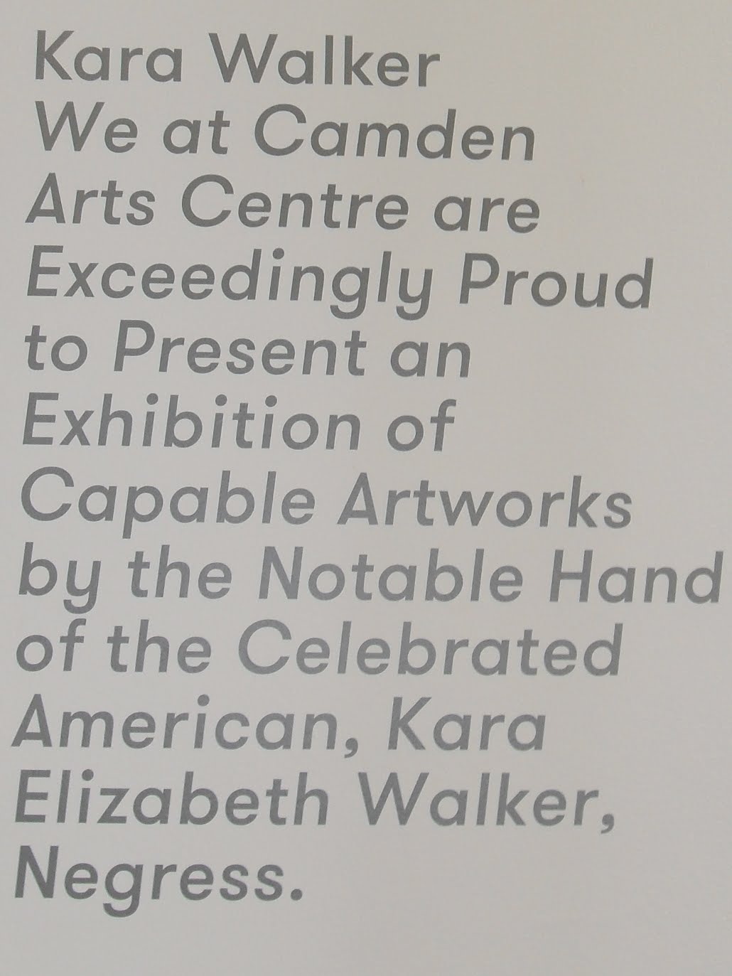
Kara Walker and black American identity at Camden Arts Centre

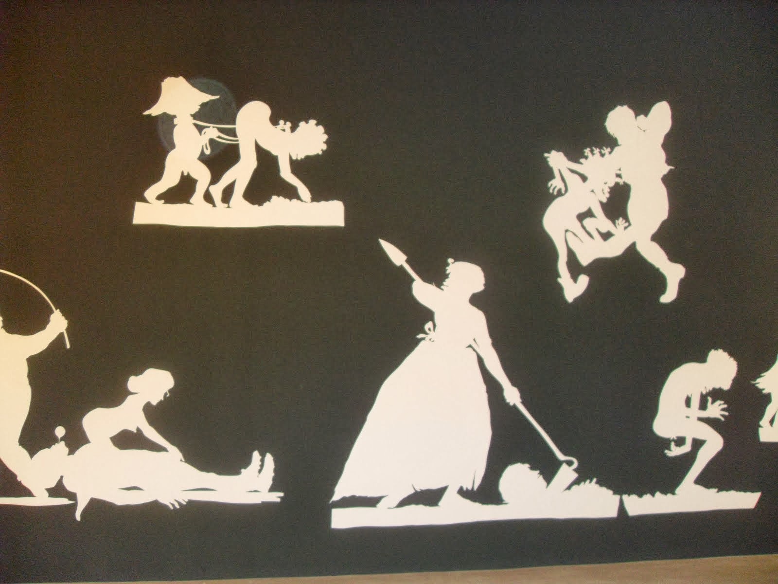
Kara Walker is a black American artist who uses familiar nineteenth-century art to subvert the traditional American image of black identity. She uses the silhouette, a highly decorous art form in which the outline of an image is cut from black paper, to comment on the physical and sexual brutality of nineteenth-century slave life. The twist is that the images are in the cartoon-like style of much traditional American depiction of black characters, adding to the subversion, as the apparently purely decorative motifs actually show often horrific events but in a style which is almost "cute". In my view, Walker's work ranks among the most effective use of satire in art ever produced.

Auntie Walker's Wall Sampler for Civilians


Auntie Walker's Wall Sampler for Civilians

Auntie Walker's Wall Sampler for Savages

The subversion extends to the captions at her exhibitions, which mimic the advertisements for slave sales.


In this show, Walker also shows large graphite sketches, Dust jackets for the Niggerati, allegedly preparatory works for book illustrations, again showing scenes of cruelty and degradation, but this time in the style of the instructional book. (They are partly a dig at certain black intellectuals, some of whom have criticised her work.)


It is interesting to speculate why this smallish show is at the relatively obscure (but highly worthy) Camden Arts Centre, when a recent show by Ellen Gallagher, whose art also refers to black identity, got a large retrospective at Tate Modern. I found Gallagher's show left me cold, probably because I was unable to decode the references (such as altered 1950s advertisements for products aimed at black Americans) and on the whole I did not find the works aesthetically pleasing (maybe I wasn't meant to). Perhaps Walker's work is considered too one-note, but she has a big enough subject to avoid repetition and she makes her points with a bite and wit I did not find in Gallagher.

Anyway, plaudits to Camden Arts Centre for putting on this show. This venue was originally a library but eventually became an arts centre run by a Trust, and is an exemplar of what can be done, offering not only high quality exhibitions but art and craft classes, a book shop and a cafe, all of which seem to be well used (all right, it's in arty Camden, but I think it would find an audience in most areas with the right support).

Camden Arts Centre


Friday, 1 November 2013

Whistler's Thames at Dulwich Picture Gallery

Blue and Gold, Old Battersea Bridge

I learned at the private view of Whistler and the Thames at Dulwich Picture Gallery that planning for this show with the Addison Gallery of American Art began before the banking crisis in 2008, the subsequent uncertainties meaning that it has only now come to fruition. It is certainly worth the wait, though not perhaps for the obvious reasons. The surprise of the show is that a good proportion of the exhibits are not paintings but etchings, and these are of a very high standard - at the time, Whistler was not unjustifiably compared to Rembrandt. But the main success of the show has to be how it emphasises Whistler's links with the Thames; American-born, Russian-educated, Paris-trained, Whistler is quintessentially multicultural, but nevertheless he spent most of his life living by the Thames and a great deal of his art engages with what he saw from his window every day. This show (and its catalogue) tells you as much about the Thames as about Whistler.

The course of Whistler's artistic development is well presented - from realism influenced by Manet and Courbet to a more impressionistic style which is almost abstract at times, and his enthusiasm for Japanese art. Whistler is perhaps seen as rather lightweight in this country - this show should go some way to raising his profile.

Incidentally, the house in Cheyne Walk where Whistler painted the famous portrait of his mother - Arrangement in gray and black No. 1 - is up for sale. Its high price (around £30m) means it's likely to go to an overseas buyer, but given Whistler's Russian connections a Russian oligarch would actually be quite appropriate.